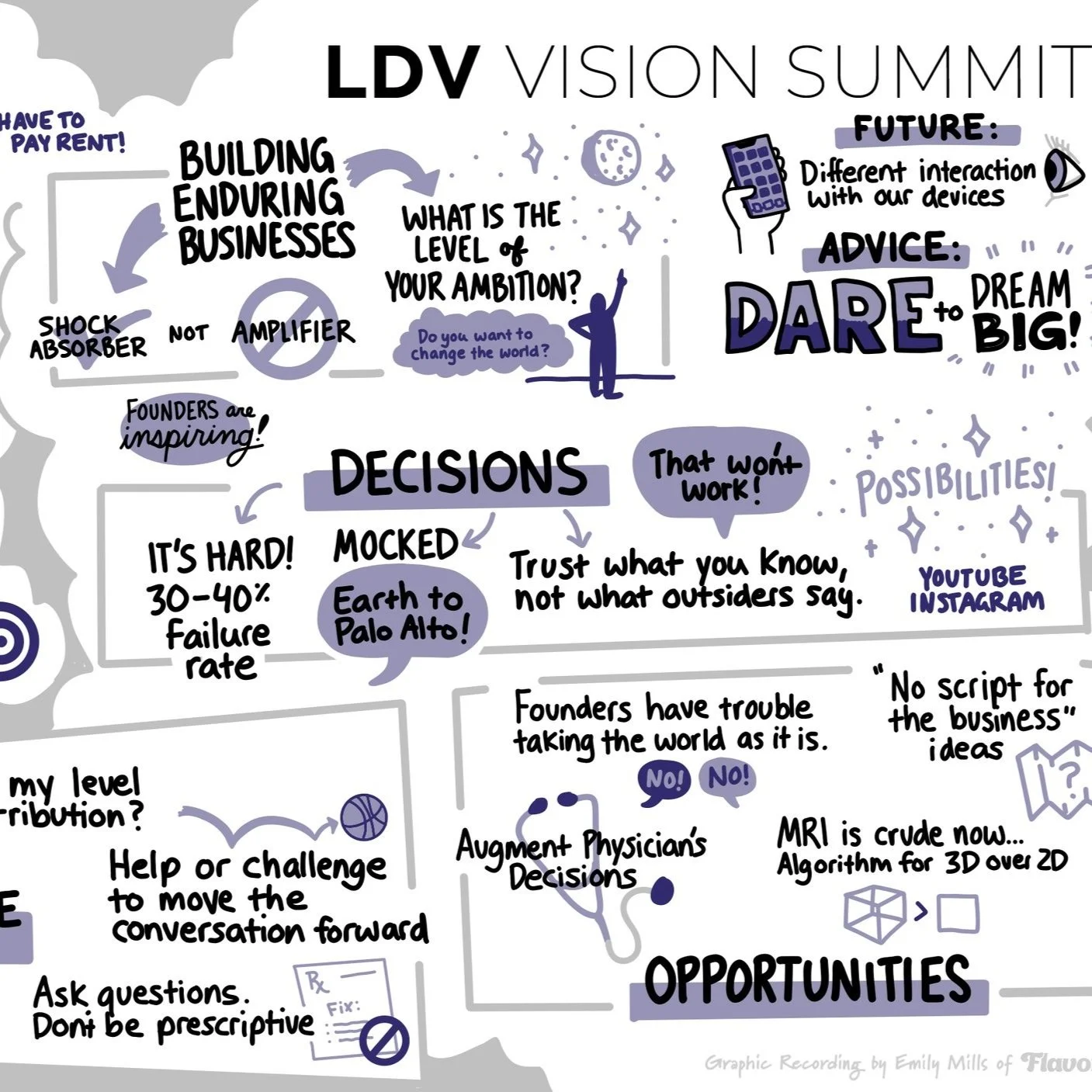
How Can Data Science Evaluate Why Some Advertising Creative Content Resonates More Than Others?
/This keynote is from our 2015 LDV Vision Summit, it was also published in our LDV Vision Book 2015.
Claudia Perlich, Chief Scientist, Dstillery

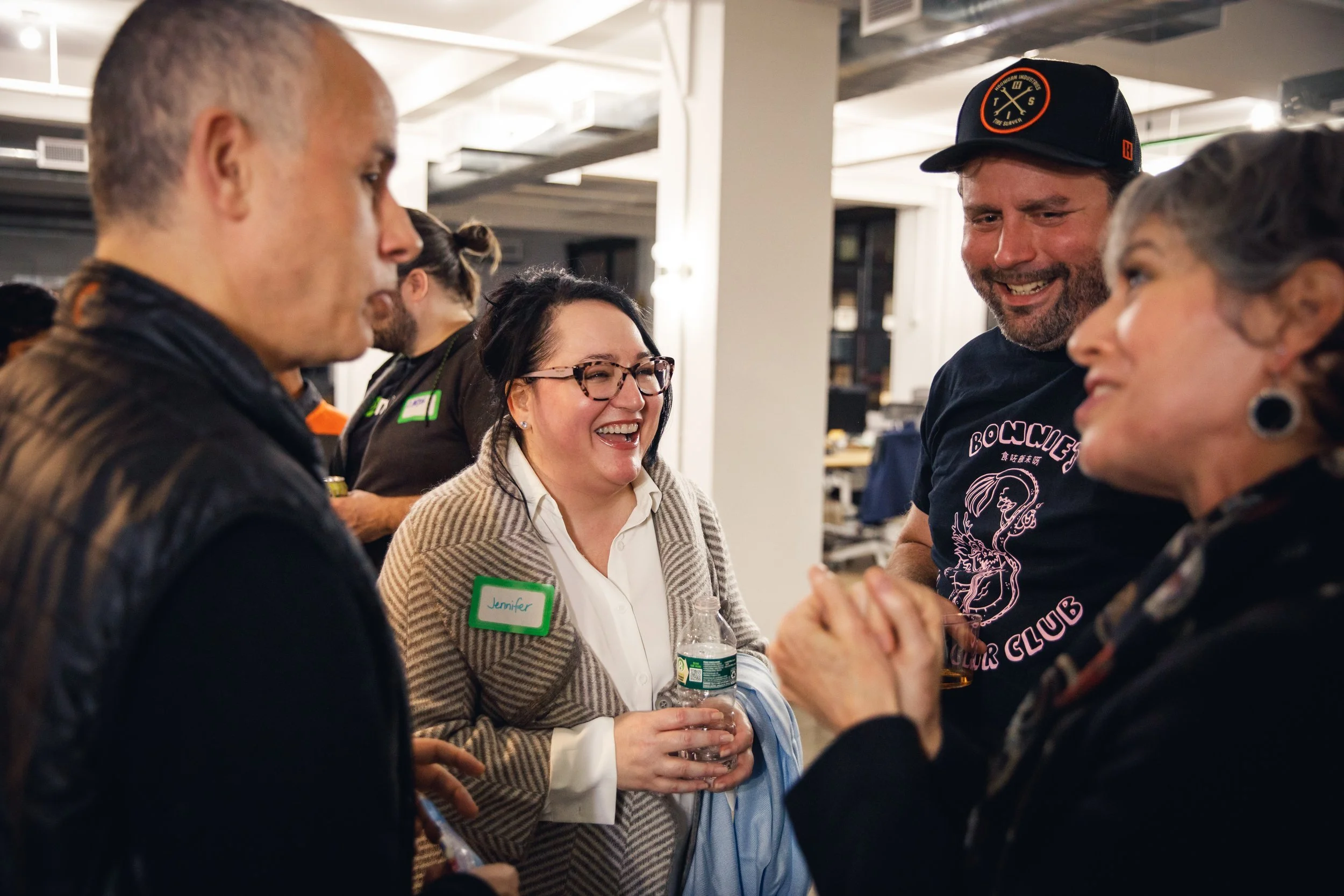
©Robert Wright/LDV Vision Summit
When Evan invited me to come and talk at a vision event, my initial response was: “I am not sure. I actually don't do vision. I typically don't even try to visualize my data.” But I thought about it and there's some very interesting development that's going on in digital advertising, in our company right now. I wanted to share the premise and maybe some of the promise of this work. It all starts with what moves us. Ultimately you would argue that the whole point of advertising is to affect people, to touch them emotionally in some way, maybe bring them closer or at least generate some interest in your product.
What I'm going to do is I'm going to show you a couple of images. And I'm asking you: What moves you?
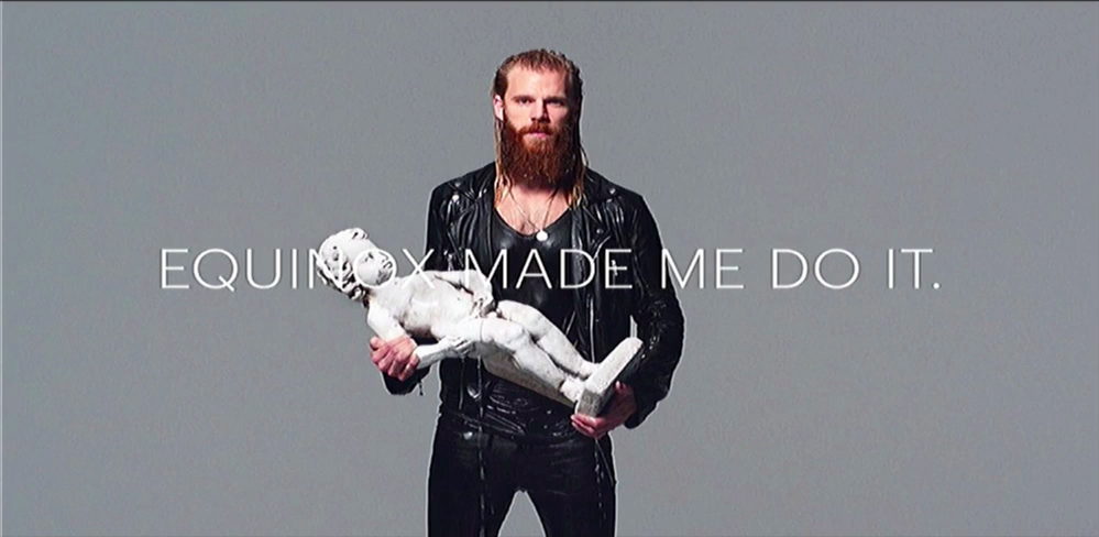


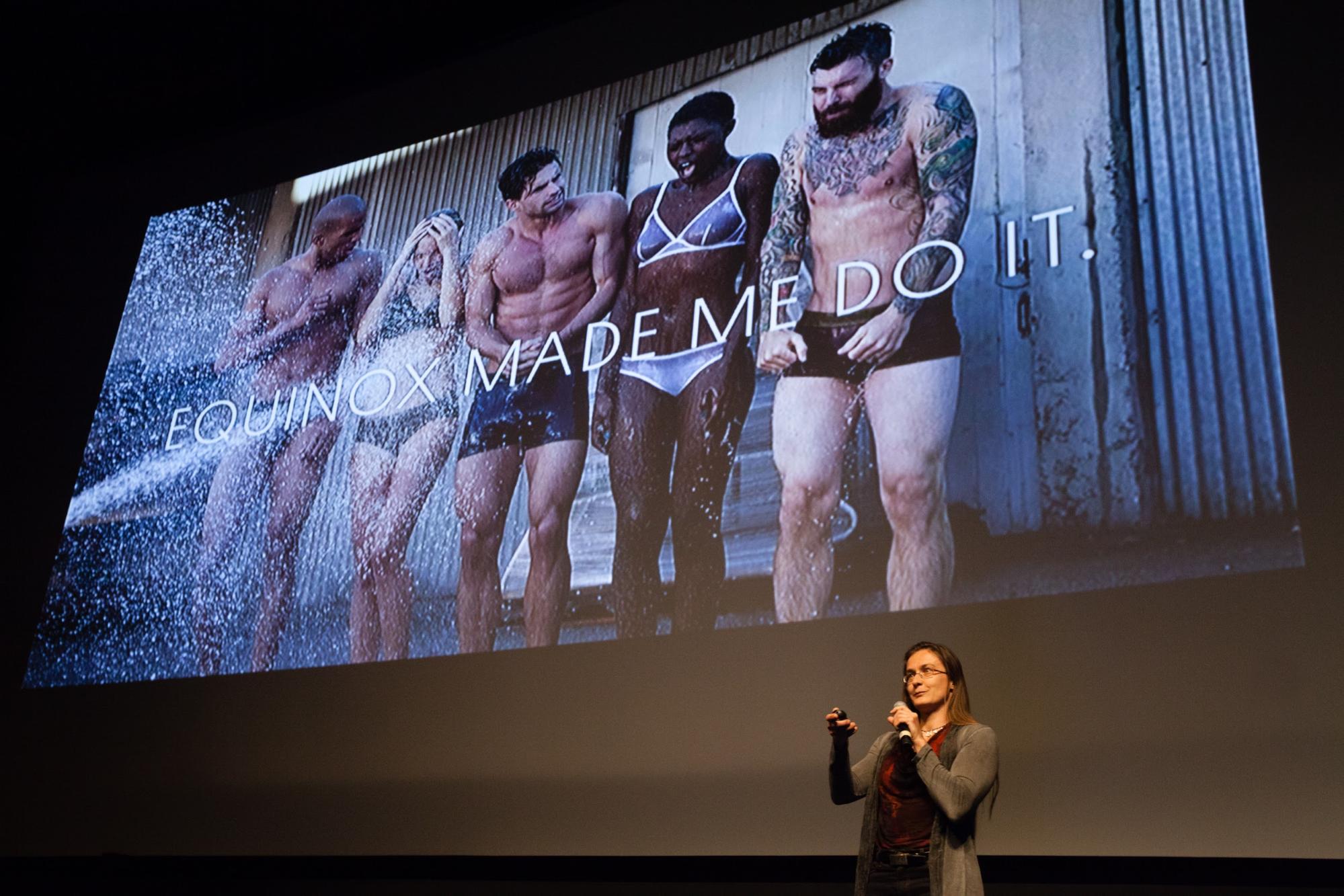
This is a pretty well known campaign. I'm sure you have seen many of those before, maybe not all of them. I will not embarrass you and ask you to raise your hand on which of those you felt most touched or affected. But chances are that we all had very different reactions to these images. I am not going to tell you which one my favorite is, but I wanted to take the opportunity to tell you a little bit of a story that few people know about me.
I grew up in East Germany and that in particular means -- and that's the irony of my life -- until age 15 I had never seen an ad because in East Germany there was no such thing as advertising. There was nothing really to sell anyways so why the hell would you want to advertise it? When the wall came down I became fascinated by ads. Not because of the product, but what I discovered was photography: beautiful images of things and nature. And where I discovered it was in cheap magazines that had incredibly well-printed and produced pictures (by my East German standards at least) . The dirty little secret is I spent my time as a teenager collecting those. It was truly because I was just incredibly amazed and touched by some of that photography. Not that I ever bought any of these things, but still.
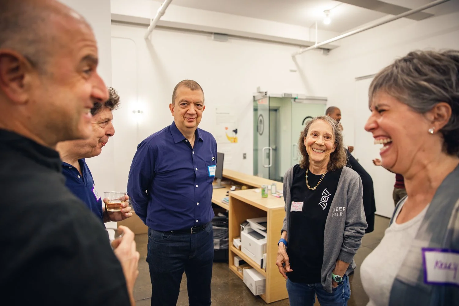
©Robert Wright/LDV Vision Summit
Images have the ability to connect to us, to touch us. I want to challenge you right now: do you think you're able to express why a given image had such an impression on you? I'm sure you can tell me which one it was and I will recognize it, but do you even know why? I personally feel that we are very restricted by language when we try to explain things, when we annotate images, when we bucket them: "This is a happy cat and this is a grumpy cat." Ultimately, language is limiting in the ability to express our emotions.

Whether or not the tale is true, that northern tribes have an exceeding number of words to describe the various types of snow, just consider that the average person’s vocabulary is estimated to be only around 17K. While this may sound like a lot in a specific context, that is all there is for all the things we may ever wish to say. Anyone ever trying to describe the subtle details of an image will soon realize how limiting already our ability to characterize colors are. How many words for different colors can you come up with? I have seen a list of about 150 and they contained a lot of analogies like “forest green.” Do you want to guess how many colors your Internet browser uses? HTML allows for 16 million. That's one of the challenges that I feel we face in machine learning when we try to explain, characterize, categorize, and annotate things. We're stuck with language and in that process, a lot of the magic and subtlety gets lost.
As I said, I work in advertising so I want to show you some of the alternatives where we're trying to avoid having to characterize what it is about an image that touches you. I don't actually have results for Equinox, so what I'm going to show you are results from a food brand. We ran an experiment where we show digital ads with a set of creatives that vary both in image and message. The interesting question is not so much “which of these variations is ‘best’” but rather to understand how different people react differently to these variations. The methodology is a combination of a random experiment alongside with machine learning. I will start initially looking at the impact of just different images.

What is this graph here? It's showing the impact of the image as a factor for different groups of people. Unfortunately I cannot show you the exact six images, and now I have to eat my words and describe them a little but in terms of what they looked like: family oriented (probably a picture with the family), individual, lifestyle, just showing the logo, some variety of the product, or just a very close up shot of the product itself. And in order to give you a talk, I also have to describe the characteristics of different groups of people to you rather than the actual millions of details that our machine-learning approach is actually processing. Specifically, I have grouped people by where they physically go -- fast food restaurants in this first comparison and gyms in the next. (We obtain the information about device locations from mobile advertising bid requests.)
The first thing you observe is that people who go to Chick-fil-A are really, really hard to sway to buy this product. No matter what it is that you show them, they're kind of happy with where they are, thank you very much. The next observation is that the “lifestyle” image is sometimes having no effect at all whereas the product image was overall the most effective across groups.

But you also see a lot of variance between these subgroups -- they react very, very differently to some of the differences in the images. Right now, this is just a very high-level picture characterizing people by the fast foods they like. But you see clear differentiation and you can think about how would you use that information to schedule or to choose separate images for sub-population if you wanted to actually specifically reach out to any of these groups.

Let’s take a look at how the messages themselves fare. Some related more to the natural process of the production. Others talked more about taking a snack at a certain time of the day. Some tried to tell you that they're really healthy and good for you, talking about the benefit of this product. What you see here is now broken up by people who go to certain gyms.
In general here you see that there's overarching effect on the emphasis of benefit: it's good for me. I mean yes, people who go to the gym probably care about the benefit and this is very consistent. But what is fascinating to see are the implicit groupings of the gyms: Equinox and Crunch are similar, and so are YMCA and LA Fitness. The populations are similar to each other in how they are affected by the message of the creative. In the case of the YMCA and the LA Fitness, the descriptive message "This is a great product, it will taste perfect" is very effective. This is the sensory stimulation that is not just limited to taste but also includes texture and how it will make you feel beyond taste.
I wanted to use this analysis as an example to really challenge our industry as we move on. What's important here is, that I wasn't trying to characterize the images in any way, but just let a machine-learning algorithm estimate how different people are affected by the message and the image. If you think this forward, maybe in the future I actually don't need to ask you whether it was the guy carrying the little statue. I might be able to predict from observed data alone which of those creatives will most likely speak to you as an individual.